Guest Post By Zachary Labe, 2020-2021 Sustainability Leadership Fellow and Postdoctoral Fellow in the Department of Atmospheric Science
I work with millions of numbers. While at first glance these numbers appear to be random, together they share patterns. As a climate scientist, my job is to analyze those important patterns and how they relate to changes in Earth’s climate. Sometime these numbers show how the rapid loss of sea ice impacts indigenous communities in northern Alaska. Or other times these numbers show the effect of warming ocean temperatures on the health of coral in the Great Barrier Reef. But these numbers always tell a story.

To visualize and understand data, scientists make graphs. And they make lots and lots of different types of graphs. In fact, I spend a majority of my day designing maps and graphs. I make graphs for scientific research papers, conference presentations, project meetings, or even just for my own exploratory data analysis. I also design graphs to share stories.
By finding shared experiences, storytelling can be a powerful form of communicating climate change. But it is no secret that discussing climate change is still really hard (e.g., see the annual Yale Climate Opinion Maps). When someone thinks of climate change, the images of polar bears floating on a piece of ice and exhaust pipes from the back of a car often come to mind. In many cases, this imagery and the impacts of climate change remain just too grim, abstract, polarized, and remote for the majority of audiences. Now we are starting to see a shift in how we think about climate change, especially by sharing more human-driven stories about climate and environmental justice issues. While those efforts are both important and effective, I also believe that there is room for data-driven climate stories.
In May of 2016, one of the first viral climate data visualizations was shared on Twitter – the Climate Spiral. The now infamous animation has been viewed by millions around the world and was even prominently featured in the opening ceremony of the 2016 Summer Olympics in Rio de Janeiro. Instead of designing this temperature data as an ordinary line (graph) that increases over time, the Climate Spiral turns the data into a striking animation that resembles a clock for our planet. This clock-like visual tells the story of our warming planet while avoiding all of the distracting details and jargon that often accompany standard scientific graphs (Hawkins et al. 2019).

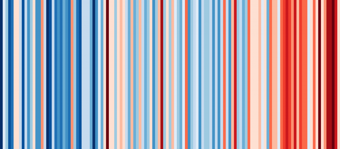
Similarly, the “Climate Stripes” were inspired from the same data set but designed in a completely different style. Each colored stripe represents a year of temperature data and highlights the long-term trend of our warming planet (shaded from blue to red). And the Climate Stripes are now everywhere. They are on cars, billboards, coffee mugs (including mine!), T-shirts, face masks, and more. Climate Stripes can even be generated for other countries and geographic regions around the world with the click of a button (https://showyourstripes.info/). The Climate Stripes are an example of breaking down complex scientific data and making it interesting for people to start their own climate change conversations.
Although the Climate Spiral and Stripes are particularly eye-catching visualizations of climate change data, improving scientific graphics can also be done on smaller scales, such as during the peer review process. For example, after a recent paper on Arctic sea ice volume, I revisited the data by focusing on the power of color to show changes in the amount of sea ice. Although it uses the same data as the collection of complex line graphs in the original scientific study, this “heat map” provides a simpler summary of the paper that can be interpreted as a story of rapid Arctic climate change. By spending time to consider the impact of color schemes, labels, color contrast, font size, and other design choices, scientists can make graphs more accessible for people with visual impairments while improving in overall science communication (e.g., check out these examples in weather and climate: https://www.climate-lab-book.ac.uk/visualisation-resources/).

Complex climate change data is also being reimagined through art, music, photography, and other creative interpretations. For inspiration in other fields of study, have a look at some of the amazing ways data is being visualized in the submissions to the Kantar Information is Beautiful Awards. There are now a number of resources available for scientists to consider when improving the accessibility of data visualizations for research and science communication (e.g., https://betterfigures.org/). Recently, the Intergovernmental Panel on Climate Change (IPCC) has put together a handbook to help scientists communicate the complexity of data and graphs in the IPCC assessment reports. There is even a chapter on visual communication with guidance provided by the Tyndall Centre for Climate Change Research following the four pillars of the MADE principle – Message, Audience, Design, Evaluation.
Scientists have the privilege of working with an enormous amount of data at their disposal. By considering design and visual communication techniques, the millions of random number patterns can be transformed into engaging data-driven stories. What stories do your data tell?
